It has been over five months since I wrote my first line in JavaScript and made this PR. Little did I know that it would be one of many over a gratifying next few months. To be honest, I cringe looking back at that piece of code. Being unfamiliar with JS and web development, I had no clue what I was doing. Thankfully, both I and covid19india.org have come a long way since then.

Starting out, my primary motivation behind contributing to the project was to learn a bit of D3.js. Over the last few years, I had seen lots of beautiful interactive visualizations built using D3 to explain complex Machine Learning concepts. I saw this as a good opportunity to learn how those visualizations were made. On the other hand, I had absolutely no interest in learning any front-end development, let alone a full-fledged web framework like React. Over time, as I got more involved in the project, and as our codebase became more complex, it became necessary to pick up React to properly review PRs, and help with development. Within a few days of the website going live, we were already swarmed with hundreds of issues/feature requests on GitHub.
Working with React panned out to be a much more enjoyable experience than I had imagined. Instead of just memorizing syntax, there were many interesting concepts to learn. As someone who's not a fan of traditional class-based programming, React hooks happened to be a godsend.
Lately, things have been quiet. The website is stable, and development is practically frozen. This has given me some time to reflect on my contributions over the past few months. A couple of things stand out in my mind. Before mentioning them, let me briefly summarize the steps involved in the Covid19India pipeline.
Our data pipeline

Telegram
All communication happens on Telegram. Throughout each day, the data-ops team monitors different government channels. As and when state authorities release their health bulletin, the members go through it and extract useful information. Sometimes there are reporting errors and figures need to be reconciled. While this entire process used to be a painful affair, with the help of some clever engineering, a good deal of this work has been automated now via Telegram bots.
Google Sheets
After extracting data from a bulletin and validating it, the members enter it into the database (fancy word for a shared Google sheet). For a while, we used to capture demographic details of patients. Since none of the bulletins contain this information anymore, our data nowadays is restricted to only daily confirmed cases, discharged/recovered cases, deaths and samples tested for each district. A simplified representation of each row in our sheet is shown below.
| Date | State | District | Entry Type | Cases | Source |
|---|---|---|---|---|---|
| 31/08/2020 | Maharashtra | Mumbai | Confirmed | 1179 | ... |
| 31/08/2020 | Maharashtra | Mumbai | Deceased | 32 | ... |
We began with a single Google Sheet, but over time, we've had to split it into multiple ones to handle the large volume of data. Splitting also ensured that one doesn't need a workstation to load the sheet on their browser.
Note: While the website looks cool and all, it's important to realize that apart from that, we also provide one of the most comprehensive datasets of the Covid-19 situation in India. This separates us from tons of other trackers out there, and brings a tremendous burden of responsibility, the handling of which usually goes unappreciated. Hence, I want to give a shout-out to all the people involved in data-ops who put in the effort day-in and day-out to make sure that everyone has access to reliable up-to-date information.
GitHub Actions
Going from the sheet to cumulative figures shown on the website requires some cleanup and processing. Every 10 minutes, a GitHub Action automatically triggers which pulls data from the Google sheets and dumps it into raw CSVs/JSONs. These are then picked up by a script which parses the data, logs numerical/typing errors, and dumps it into structured JSONs which act as our APIs.
If I had to pick one, then using GitHub actions to fetch, process and dump the APIs might be the most ingenious thing in our whole pipeline. It's flexible (we can script in different languages), fast (can iterate through our whole dataset within minutes), and reliable (though it breaks, but infrequently). Not to mention, it's free for public repositories.
Website
Finally, these APIs are loaded in the background whenever someone visits covid19india.org. Here, the figures are processed and extra statistics such as recovery rate, positivity rate, etc. are calculated. These are then displayed on the table, and also as a map and time-series chart.
The website itself is built with React.js, and bootstrapped using Create React App (CRA). It is a client-side rendered, single page application (SPA) hosted free on GitHub pages. On the aesthetic side, we have designed it to be minimal, interactive, and humane. On the performance side, we spent plenty of time in making it efficient by minimizing re-renders (using React.memo for memoizing components), and lazily loading smaller sized bundles (code-splitting via React.lazy). Lastly, all the visualizations are created using D3.js.
One regret that I have is that we didn't leverage a React framework like Next.js to pre-render the website at build time. This would've reduced boilerplate code, and resulted in better SEO and performance.
Edit: Our official blog has a new article which goes into more detail about the pipeline.
My contributions
Apart from tweaking how things look and perform on the website, my primary contributions have been in creating interactive visualizations and setting up APIs for loading data. Each day, we gather details for hundreds of districts in India. That's a lot of data which needs to be properly handled, visualized, and put into context. A couple of interesting things that I did in this regard are mentioned below.
API design
Our website is unconventional in the sense that there's no database server (aka back-end framework). It's only a static webpage served through GitHub pages. What this means is that all the data displayed on the website has to be stored in files (static APIs) which are loaded and processed by the browser. There's no server to respond to a user's request and process the data. Thus, we had to come up with creative ways for storing the data to ensure minimal processing and hence, good performance on browsers.
In the initial days, we had separate APIs for different data - state/district counts, testing figures, time-series etc. These were all stored in different formats, and then pre-processed and combined on the browser. This meant that we had to maintain a bunch of ugly JS code on the front-end to do all the processing. Two months down the line, we realized that this was acting both as a performance bottleneck, and a scalability issue since it was restricting how we could transform/split-up the data.
Consequently, we went back to the drawing board and came up with the idea of introducing another layer of data processing in the pipeline. This layer would parse the raw data and dump two well-structured APIs that the website would use. Since we were directly using the raw data, this also acted as a validation step to check for typos/errors. Keeping in mind the structure of the website code, we designed the new APIs such that they required minimal processing on the front-end. This improved the performance of the website. Further, we also tried to make the new APIs more memory efficient, readable, and easy to debug.
I've shown the basic building block of the redesigned API below. Jeremy has a great post describing in more detail the rationale behind such an API structure.
{
  ...
  "MH": {
    "delta": {
      "confirmed": 11852,
      "deceased": 184,
      "other": 2,
      "recovered": 11158,
      "tested": 52503
    },
    "districts": {
      ...
      "Mumbai": {...},
      ...
    },
    "meta": {
      "last_updated": "2020-08-31T21:54:22+05:30",
      "notes": "...",
      "population": 122153000,
      "tested": {
        "last_updated": "2020-08-31",
        "source": "https://t.co/HJvWeWpH66?amp=1"
      }
    },
    "total": {
      "confirmed": 792541,
      "deceased": 24583,
      "other": 343,
      "recovered": 573559,
      "tested": 4145123
    }
  },
  ...
}
During this time, we also came up with a clever way to efficiently utilize the new API for viewing Covid-19 data of past dates. Being heavily nested, it's not the most user-friendly format for researchers/analysts, but it turned out to be quite effective for our use-case. It allowed us to reuse a lot of code since data across dates and states/districts shared the same schema.
Side Note: Jeremy came up with the initial design and implementation of a new API which aggregated data from other pre-processed APIs. I had to pull out a couple of all-nighters and write my own implementation to convince him we could do better by instead directly parsing the raw data. Following this, he worked on the UI to switch between different dates on the website using the new API, while I ironed out the issues with the parser and data. Funny how a bit of competition sometimes leads to better collaboration.
Bubble map
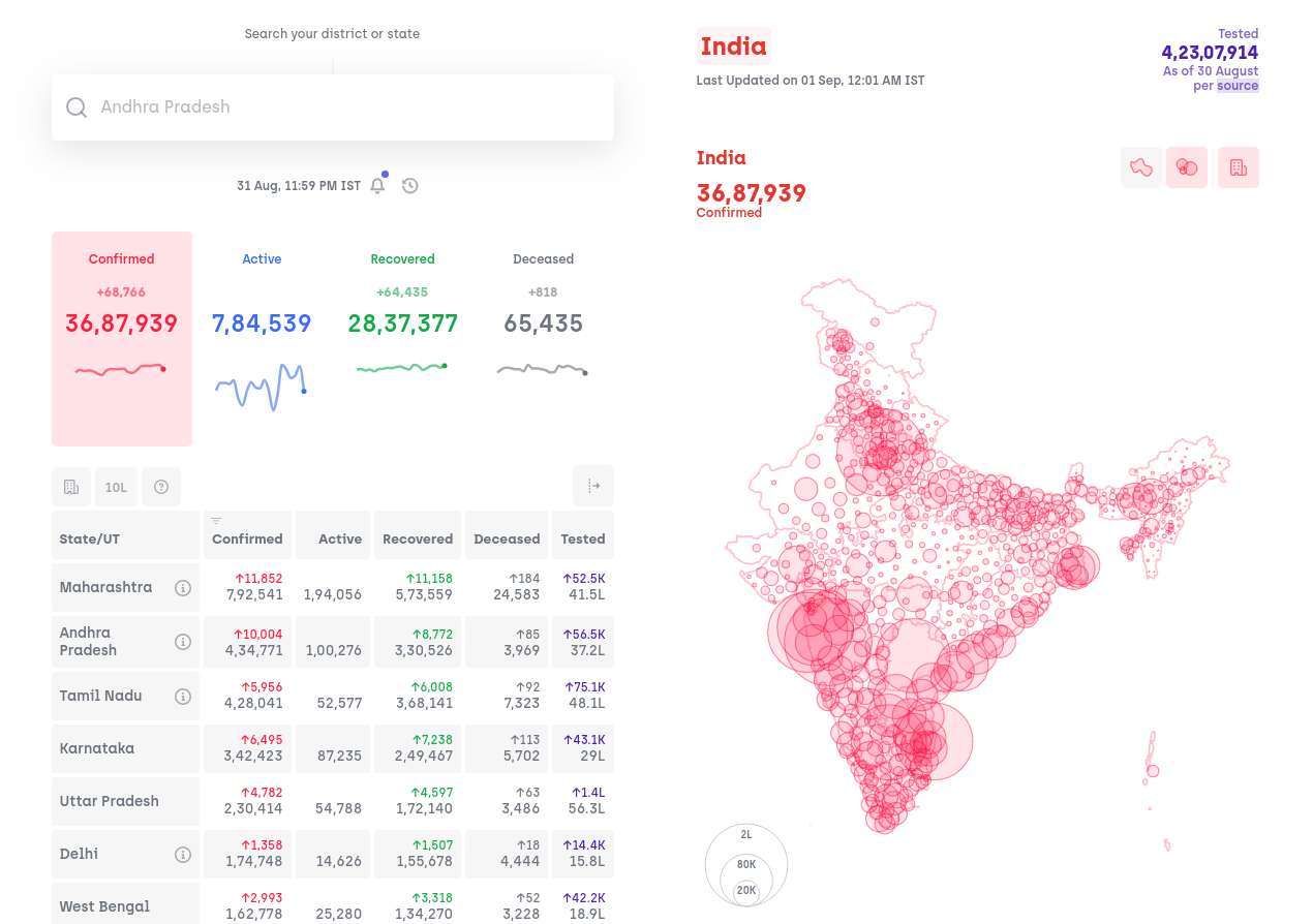
We started with a simple state-level choropleth map of India to show the geographical spread of the virus. Over time, it became apparent that this was not the best representation of ground reality. A choropleth is inherently biased to give importance to larger regions in a map. As an example, Delhi which was contributing lots of cases to the nation-wide tally was barely noticeable in the map. Also, while the virus was initially concentrated only in large cities within a state, there was no way to convey this information on a state-level map. Hence, we experimented with other visualizations before settling on a district-level bubble map of the country as the best geographical representation of our data. Since there's no official source of updated Indian maps in a digital format, we had to create our own.


Inadvertently, it also turned out to be a terrific way to visualize how the virus has spread away from big cities into smaller towns over the past few months since the lockdown ended.
Misc visualizations
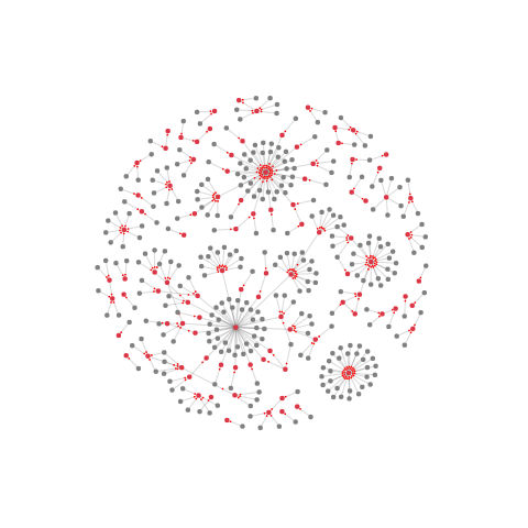
Over time, we've had to deprecate stuff from the website once it became irrelevant or inaccurate. This includes a listing of essential services open during the lockdown, demographic distribution of Covid-19 patients, zonal classification of districts, etc. Another one of them was a network graph of transmission (shown below). Here, each node represented a person, and links between them represented transmission of the virus from one person to another. While on its own, it didn't convey any actionable information, it was a great visualization of how the virus spread within a community.


Closing Thoughts
The past few months have been quite a ride. We closed more than 2000 issues/PRs on our GitHub repository, and received code contributions from over 100 different authors. While it feels surreal to have been a part of something noble and serving millions of people in the country, it has been a bittersweet journey overall.
Having parents who are both doctors, Covid-19, from the start, was something which hit close to home. Several months into the pandemic, it's disheartening to see the country still recording highs in the number of cases, and over a thousand lives being lost every day. Adding to that, the recently released GDP/GST figures seem to indicate that Covid-19 might have been a catalyst to an even grimmer economic reality.
I intended to end on an optimistic note, but it's difficult to find a silver lining amid all this. The best I can hope for right now is that the armchair epidemiologists on Twitter turn out to be right, and the Covid-19 situation improves from September.